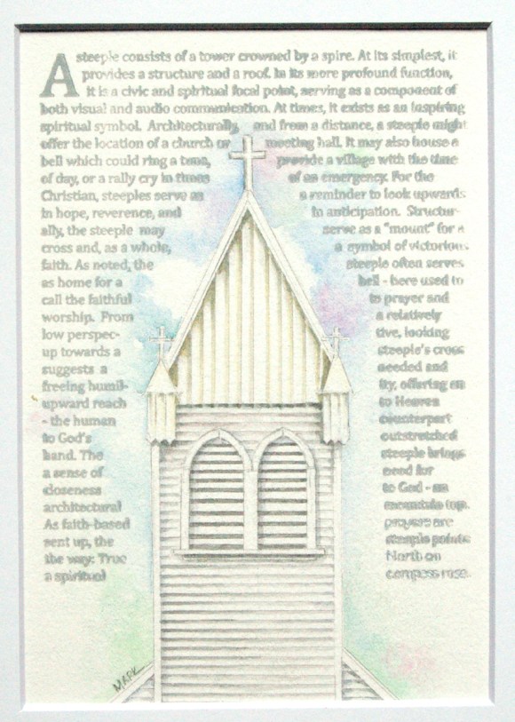
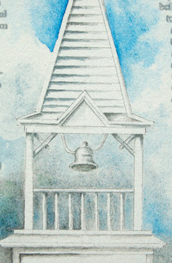
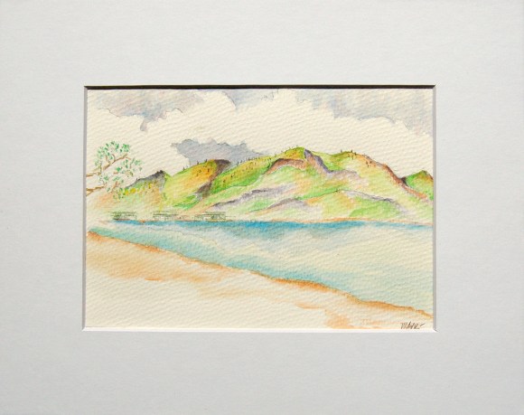
Part of the successful solution on this piece was to create interest with the siding, which includes both horizontal and vertical. Together, they really show light source and architectural shape. I worked the shadows and eve shadows well I think – really happy with the depth. I also really like the slight golden glow on the facade.
Simple as it seems, and looks, the background is always a big set of decisions. In this case, I’ve kept the sky/bkgnd simple and a bit vague. I did, however, work to create a nondescript-yet-suggested transition of sky-to-trees.
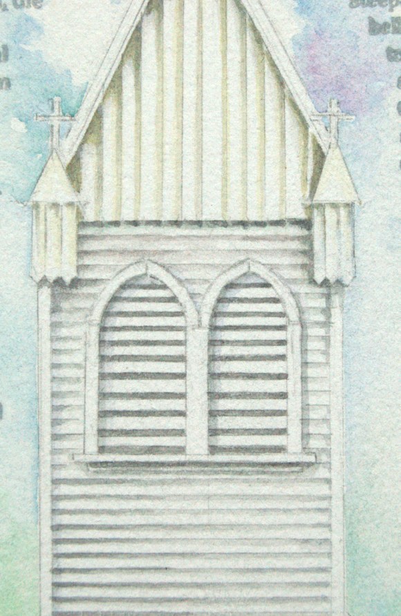
Here’s the detail. It was a bit of a trick to define the bell tower vents. To set them apart from the siding laps, I gave the shadows a slightly darker tint: after all, they are not shadows … rather, they are openings into the steeple to allow for bell sound to travel. I also created the opening slats at a slightly different pace/setting (given they are not siding laps).
Beginning a new piece! Actually, began it couple weeks ago, but am late to the blog … gotta get better discipline (and keep life at bay)! 🙂
This one is based upon a church I saw that has, in addition to the top steeple cross, 4 smaller crosses, one at each corner at the base of the steeple proper. Of course, I understand how 4 works into the archetectural equation, but my painting will show 3 … which works better for me, spiritually, than 4. The model church looks quite dignified, I really like the basic looks.
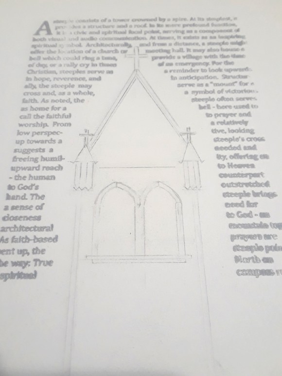
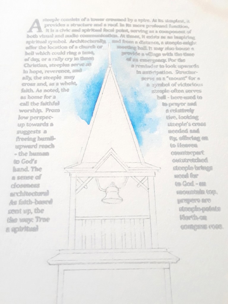
Here’s the initial sketch. Of course, I’m using the letterpress text sheets I printed, I think that is working well as secondary basic format. Don’t think I’ve mentioned it before, I printed on Rives BFK paper: I love this paper, have used it for printing, drawing, painting for years. It’s a mould made paper from France. I think it’s 280 # and is very smooth, soft to touch, and is 100% cotton. Pricey, but I love it!
And done with the first of the Steeple Project pieces!
It’s taken a while … concept, writing, letterpress, sketch, and painting … but I’m happy with the idea in general and this first piece specifically. I’m glad I spent some dedicated time on the text. The spiritual-side is critical for me. The architectural, social/historical, and even the artistic elements are, for me, enhanced and united within the spiritual in this series. I need that perspective, it’s a big part of this project for me.
As I’ve mentioned, I feel best, even blessed, beginning with a detailed sketch.
(Gad, I need to work on better photos … )
I guess part of the danger is an overly structured painting, but the intent is to move beyond the sketch, let the paint flow a bit … paint outside the lines as inspired. Perhaps I need to develop a looser initial approach … but I feel I get looser as I proceed, and don’t really feel confined by the sketch, rather, guided … it all works out in the end … ( … theory … ) :]
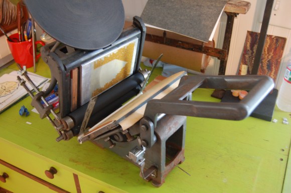
Ok, last image was of the plate up in the chase/press. For those/any interested, my press is a very old Kelsey 5×8″ tabletop. I love the rattle-and-clank … a lot of noise and action, very, very analog ….
Print quality: My original intent was to print so lightly that the text would be obfuscated (takes me back to Click and Clack, the tappet brothers) … barely legible, thinking it is actually background information, visual information. As it printed, it was darker gray than I intended, but decided to let it go as it was also printing unevenly … which didn’t bother me much as that also served to render the image/text fuzzy, secondary to the painting to come. I think I’ll go with it as-is for a few paintings, see how I like it after a some are complete …
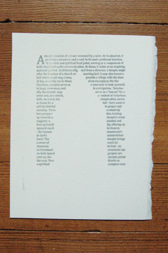
Later: here’s a sample of the prints … I like it very much!!
(sorry, crummy photo …)
For those curious, here’s the text in full:
A steeple consists of a tower crowned by a spire. At its simplest, it provides a structure and a roof. In its more profound function, it is a civic and spiritual focal point, serving as a component of both visual and audio communication. At times, it exists as an inspiring spiritual symbol. Architecturally, and from a distance, a steeple might offer the location of a church or meeting hall. It may also house a bell which could ring a tune, provide a village with the time of day, or a rally cry in times of an emergency. For the Christian, steeples serve as a reminder to look upwards in hope, reverence, and in anticipation. Structurally, the steeple may serve as a “mount” for a cross and, as a whole, a symbol of victorious faith. As noted, the steeple often serves as home for a bell – here used to call the faithful to prayer and worship. From a relatively low perspective, looking up towards a steeple’s cross suggests a needed and freeing humility, offering an upward reach to Heaven – the human counterpart to God’s outstretched hand. The steeple brings a sense of need for closeness to God – an architectural mountain top. As faith-based prayers are sent up, the steeple points the way: True North on a spiritual compass rose.
Clearly, in addition to zig-zagging thru efforts for art, life occurs as well. It’s been a few busy life-stuff days … hence the post gap. But now, a milestone art event: the beginning of a new project! My intention is to have this as an ongoing project, probably interspersed with other work … (remember that word I’m looking for?)
I tend to lean towards art that has (for me), not only visual interest, but also a spiritual side to it. This side can range from very subtle, implied-but-not obvious … to blatantly and joyously declared. I was taught years ago that great, or at least art that can be related-to, will contain at least one of three aspects … and the very best or most relatable and meaningful art, has all three. More on that perhaps in a later post …
At any rate, the Steeple Project. I, as many of you no doubt do, admire much in architecture. One aspect I find interesting is the variety of church steeple design: some very simple, some complex and excessively adorned – I prefer the simple :), but appreciate the design and purpose of all . I mentioned earlier that I have a little, ancient letterpress. My intent is to use that media in conjunction with my watercolor effort. I had, awhile back, designed some background text to be used on the project, this text to be converted to a printing plate for my press. Well, the plate arrived, added to the chase, and mounted in my little press … ink ready!
(side note: oh my gosh … all of a sudden, the foot symbol has given away to appropriate apostrophes …. no idea how that happened … but, love it, thank God! If you care, see blog note Aug 13 for my typographic winning ….)
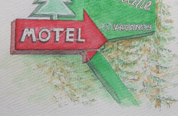
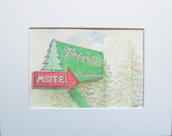
I like the simplicity, even though the sign drawing and depth was more complicated/detailed than it looks. Here’s a detail:
A real crux was the neon tubes. I first tried using my finest brush and white watercolor, but it just looked clunky. I finally opted for a combo of that white and very light, broken pencil lines. Probably purest WC painters cringe when I say “pencil lines”, but this bit of mixed-media often seems to work best for me. Overall, I’m very happy with it, I like this sign and am very happy with my painting. Room to grow and improve, yes … but happy.
(sidebar thought: Gad!! What’s with those quote [ ” ] marks? Those aren’t quotes or apostrophe marks, rather symbols for inch [ ” ] and [ ‘ ] feet. How do I get typography symbols instead of these????).
By the way, the painting is on 300# cold press. Painted image is approx. 4.5″ by 6.5″, will be mounted in an 8×10″ mat.
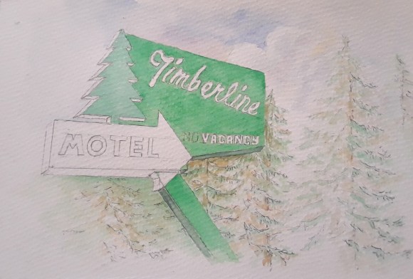
Color has appeared! I finished some background sketches, simple trees and some sky, then moved, with trepidation, to the palette. Once there, the die is cast (dye?), and I’m liking it. Some big decisions to make going forward, like how detailed to make the neon tubes: go very tight (and on everything which looses some of the looseness I’m after) or match the loose feel – yet get enough detail to tell the story … we’ll see …
So, here’s where I am – have added some text and details …
Liking where it’s going thus far, soon on-to some watercolor! However, that’s always a scary thing … there’s such a good chance of trashing a decent sketch by adding color, the temptation is to turn it into a b&w drawing … oh well, onward to color!