Categories
Uncategorized

… complete, I think …

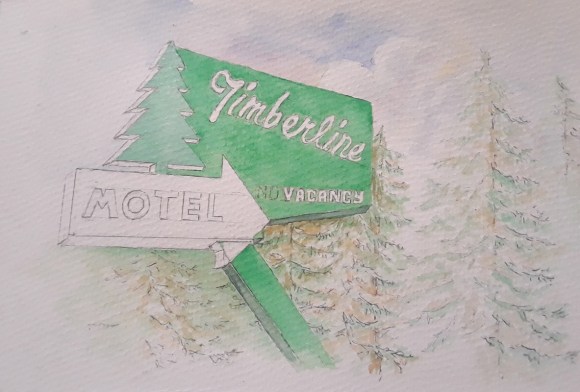
Ok, here it is. Completed …

I like the simplicity, even though the sign drawing and depth was more complicated/detailed than it looks. Here’s a detail:
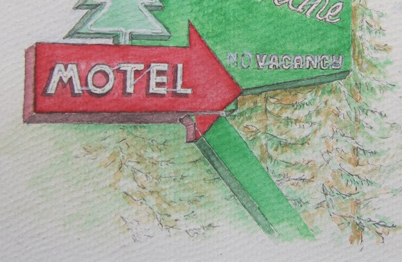
A real crux was the neon tubes. I first tried using my finest brush and white watercolor, but it just looked clunky. I finally opted for a combo of that white and very light, broken pencil lines. Probably purest WC painters cringe when I say “pencil lines”, but this bit of mixed-media often seems to work best for me. Overall, I’m very happy with it, I like this sign and am very happy with my painting. Room to grow and improve, yes … but happy.

(sidebar thought: Gad!! What’s with those quote [ ” ] marks? Those aren’t quotes or apostrophe marks, rather symbols for inch [ ” ] and [ ‘ ] feet. How do I get typography symbols instead of these????).
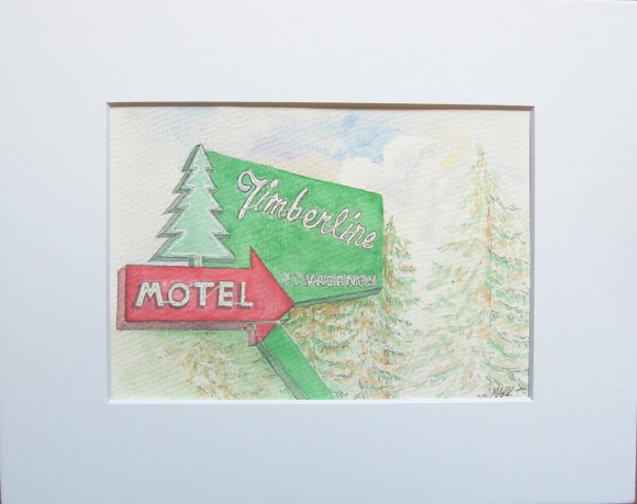
By the way, the painting is on 300# cold press. Painted image is approx. 4.5″ by 6.5″, will be mounted in an 8×10″ mat.

FYI … this painting for sale in my Watercolor Gallery … 🙂

.
Categories
Uncategorized

… color! …

Color has appeared! I finished some background sketches, simple trees and some sky, then moved, with trepidation, to the palette. Once there, the die is cast (dye?), and I’m liking it. Some big decisions to make going forward, like how detailed to make the neon tubes: go very tight (and on everything which looses some of the looseness I’m after) or match the loose feel – yet get enough detail to tell the story … we’ll see …


Meantime, I’m liking the way it’s progressing!

Categories
Uncategorized

… sketching-on …

So, here’s where I am – have added some text and details …

Liking where it’s going thus far, soon on-to some watercolor! However, that’s always a scary thing … there’s such a good chance of trashing a decent sketch by adding color, the temptation is to turn it into a b&w drawing … oh well, onward to color!

Categories
Uncategorized

… a great sign …

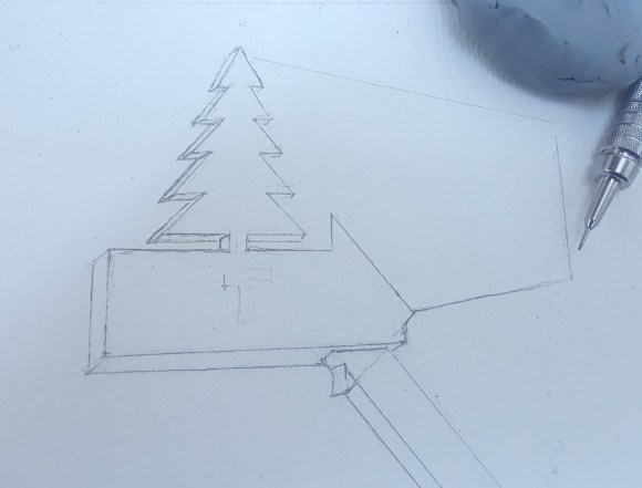
Like so many of us, I really like old, vintage signs… painted metal, neon, great and simple analog shapes. I’ve decided to paint one I’ve driven past several times. It’s just great: green and red text areas, an arrow and a tree shape, big white letters with white neon outlines … cool! A little rough-for-wear these days, but a great sign still.

Here’s my start, my sketch. Like I mentioned before, I seem to need to spend a great deal of time on the sketch. This work will especially need sketch time: trees and background I can wing, but the sign itself … perspective, the sign isn’t a true rectangle, a lot of edges and such … not to mention – any painting is a challenge for me … but it’ll be good time. I like this sign … here we go!

Categories
Uncategorized

… His train …

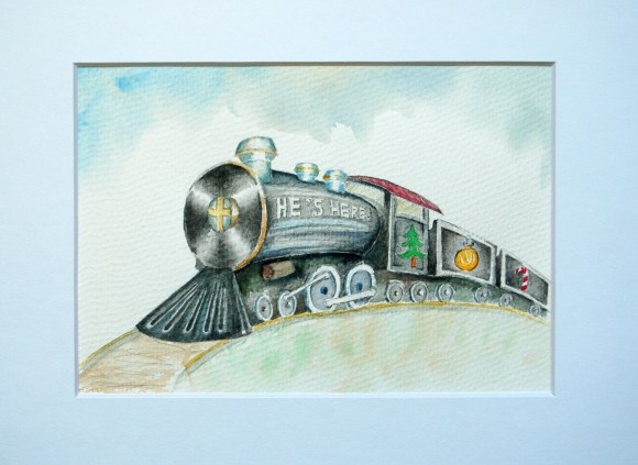
Here’s a departure little painting from couple of months ago, a train in kind-a a Christmas mode…

I enjoy painting/drawing subjects that are mechanical/architectural/structural in nature. I guess it’s because I spent a good deal of time as a draftsman in my early years, took a couple drafting courses, etc.. So physical items come a bit more naturally to me than organic. But along with that comes a responsibility: you can paint a rhododendron without critical notice of the layout … but paint a building façade and perspective with scream at you … it just won’t look good if it’s off. So, it keeps you honest, or humble (I find both).

Anyways, here’s a fun little train …

FYI … this painting for sale in my Watercolor Gallery … 🙂

.

Categories
Uncategorized

… lake shore …

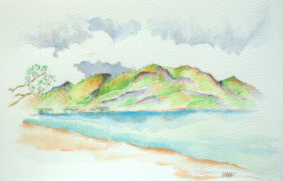
Another little painting I did a month or so back, some bare mountains behind Lake Chellan. I played with using contrasting colors in the shadow areas – I like them, kinda snappy, but actually looks a quite like the scene I was painting.

I’m finding I spend much more time on the sketch than I would think. Without a good sketch/layout, I tend to get lost in the painting … and with watercolors, at least with me, to not be on target once the paints come out, it’s a mess. Maybe I’m not to a “wing-it” level, but I need a good layout/plan (sketch) before I get to paint. My confidence grows with a good sketch 🙂

FYI … this painting for sale in my Watercolor Gallery … 🙂

.
Categories
Uncategorized

… railroad bridge …

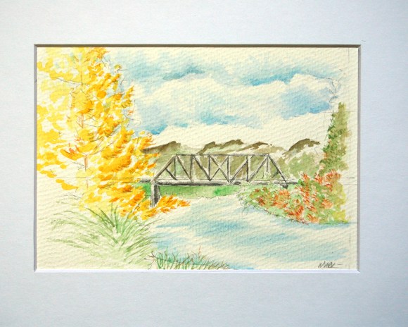
Here’s a little (about 4.5 x 6.5″ ) watercolor I did a little while back, I’m pretty happy with it (yet knowing I have a good deal of growing to do…). It’s not so much muddy, has a good cleanliness/brightness about it. Not sure if that’s true clean/ bright, or if it’s just not very deep (chromatically)… but yeah, for me, not bad.

FYI … this painting for sale in my Watercolor Gallery … 🙂

.
Categories
Uncategorized

… so …

So, the odd, or incomplete, blog title stems from a characteristic of mine: a tendency to move from one media to another … and back again … I see some artists as focused, dedicated oil painters or sculptors, writers or photographers, watercolorists or graphic designers. Me? One day or month I’ll be all-into painting watercolors. The next, I’ve just got to get my camera out and get down into some serious silver gelatin. I dabble a bit, then before I realize it, I’m off to something else. Did I mention I also have a little letterpress? I’d like to write.

Even within media: oil vs watercolor vs mixed … 35mm vs 2 1/4 vs 4×5 vs 8×10 … hand-set lead vs poly …

Gad.

I think I’d think it all just fine, if when I moved into an artistic pursuit that I indeed produced some great images before flipping… but, truth be told, though blessed with some ability to scratch-out some work that is ok … it’s just that … “ok”. My b&w’s are not Ansel Adams prints. My watercolors trend muddy, definitely not Jeffery Hull. I wish I had concentrated more on life drawing when in school.

This all leads me to become very frustrated with myself, this seeming lack of focus. But, hey … it’s only me … and that’s ok. I’ll be content with a blessing of variety and the yearning to improve.

As Steinbeck said, “Whirra, whirra, whirra … ”