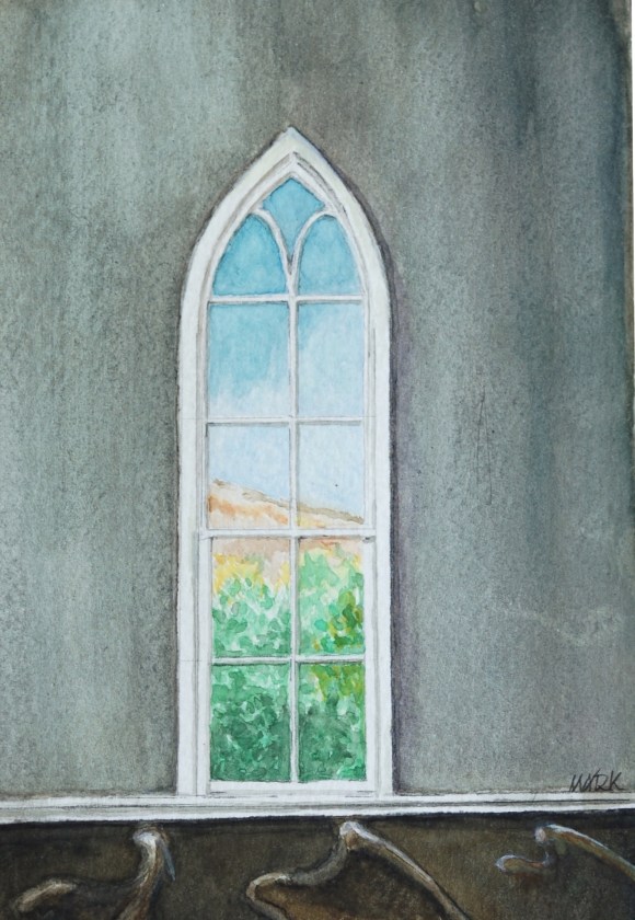
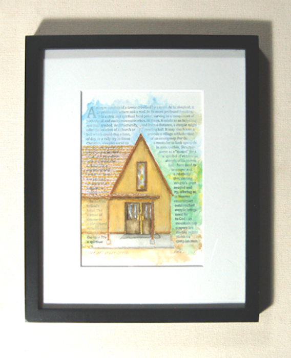
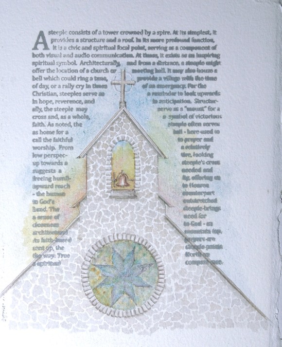
This piece is inspired, not by a specific church, but rather is something of a culmination of many windows seen throughout my life. It’s the message.
I’ve tried my hand at building stained-glass windows (of course, “… peripatetic, perambulatory, desultory .. ” what is that word … ?!?!). I really appreciate the physical side of it: heavy, mechanical, structural … and the artistic as well: simplified images and color, planned/conceptual, simple, to the point. It’s a great media. And, in the hands of a real artist, art with a huge presence.
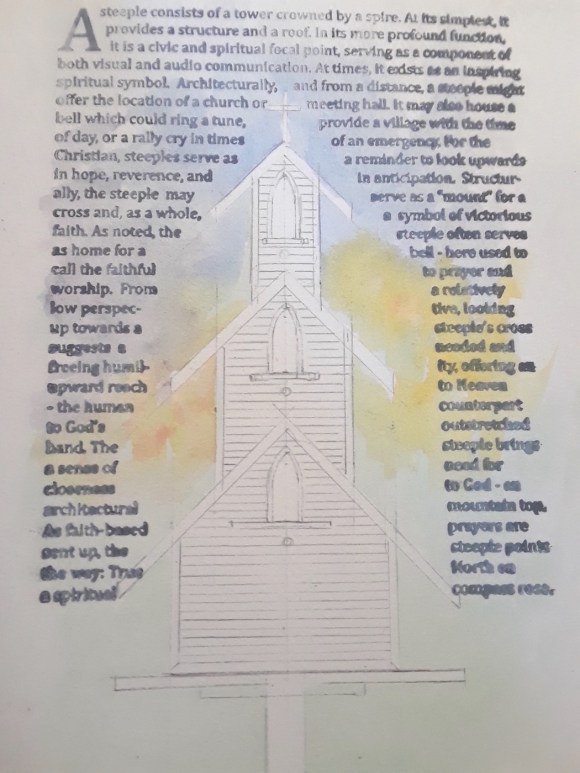
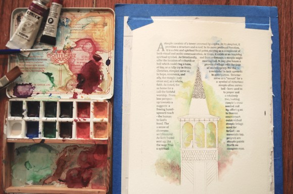
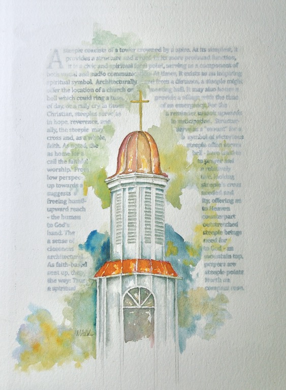
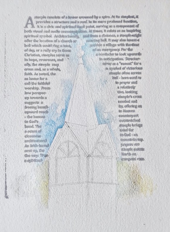
Here’s the initial sketch:
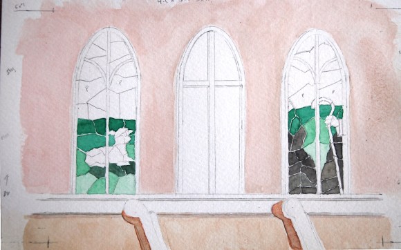
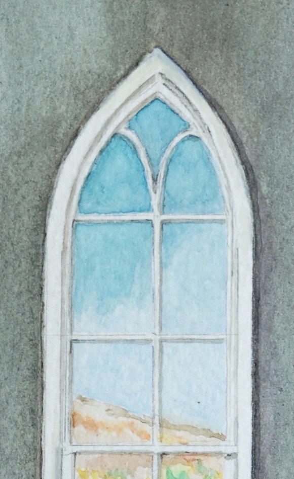
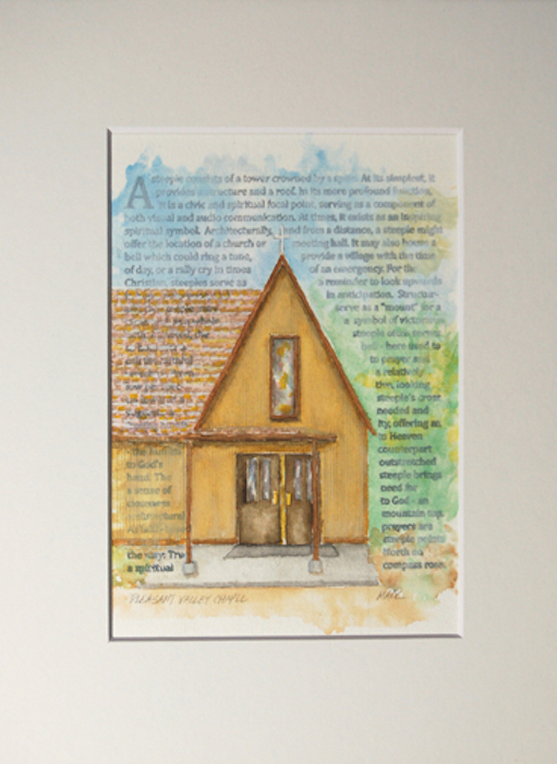
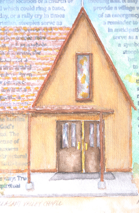
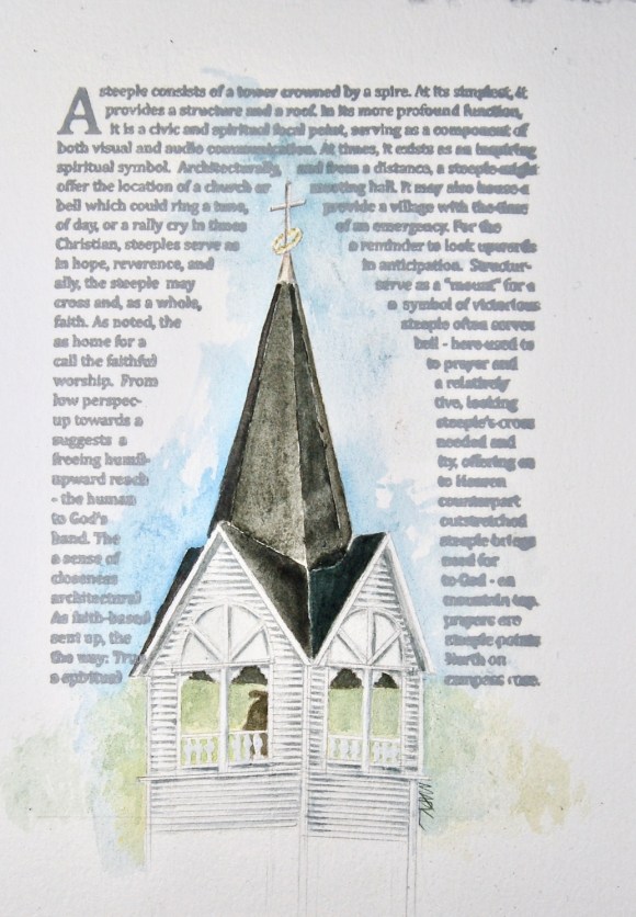
… and the final.

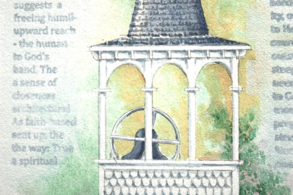
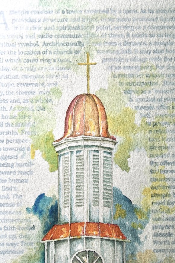
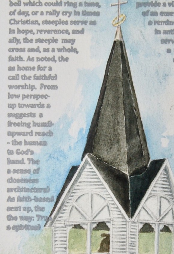
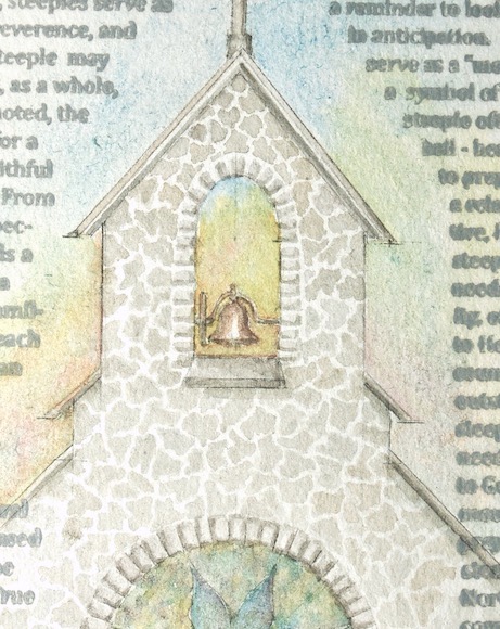
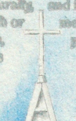
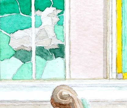
… and a detail …
I’m happy with this. The mosaic of stained glass windows is a tough, for me, path to take – but I’m happy with it. Funny, but I’m also very happy with how the pews turned out … simple, but reads well I think. Don’t get me wrong, I have not arrived at a place I’m truly happy with watercolor-wise … but am happy with my effort and progress to-date.
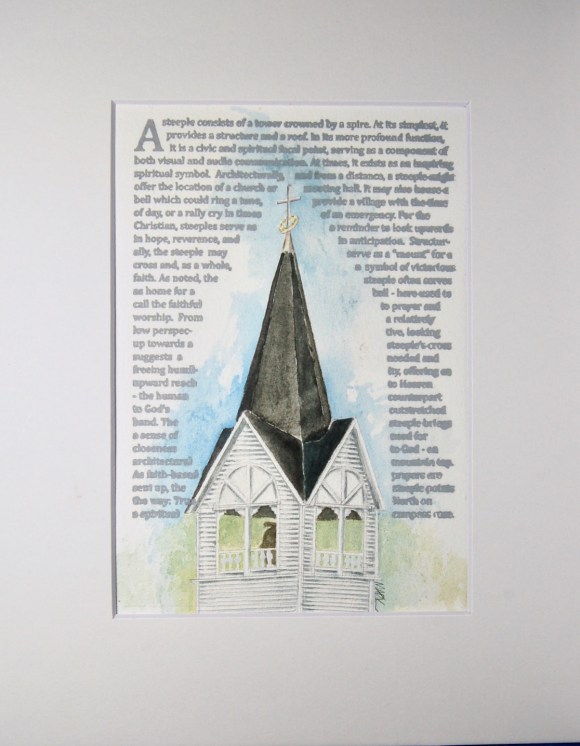
FYI … this painting for sale in my Inside: Looking Out Gallery … 🙂
.