Just published a post I wrote months ago … just didn’t get back to publish it … so, there it is.
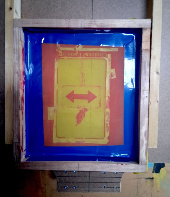
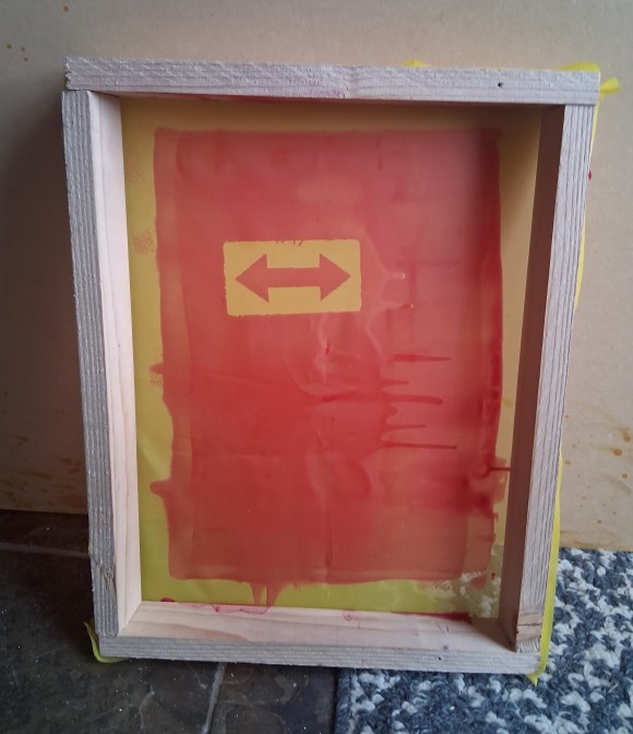
Today, I picked-up on the project, and finally tried to put ink on fabric. Mixed results … tried to print on three shirts, one a success – so, hope reigning eternal and such, I’m excited: from the one shirt, I get the confidence that printing more can be done. I just need to even-out the process/technique. My homemade equipment lacks the precision to be consistent – to many flex points, etc.. must I invest in a press? My screens are already showing signs of image failure – telling me I need to burn screens better, etc..
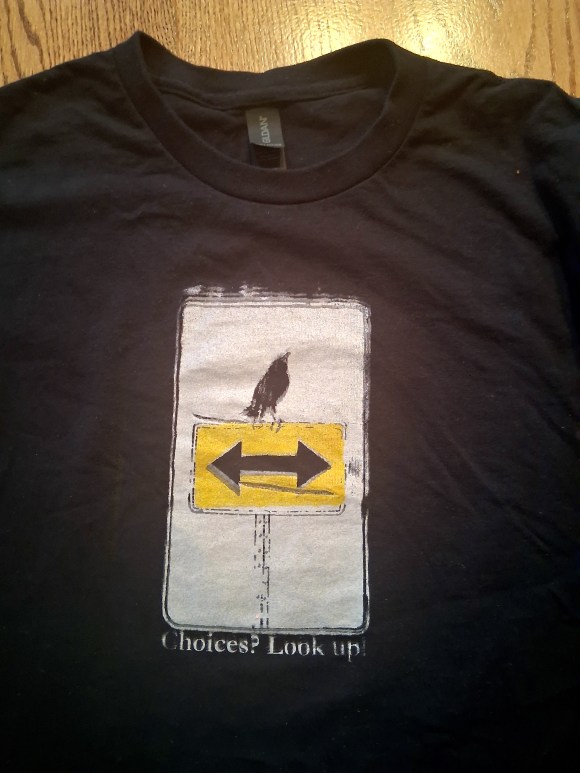
BUT! I did get a good print – success!! This is great news, I really like (and believe) this concept!!
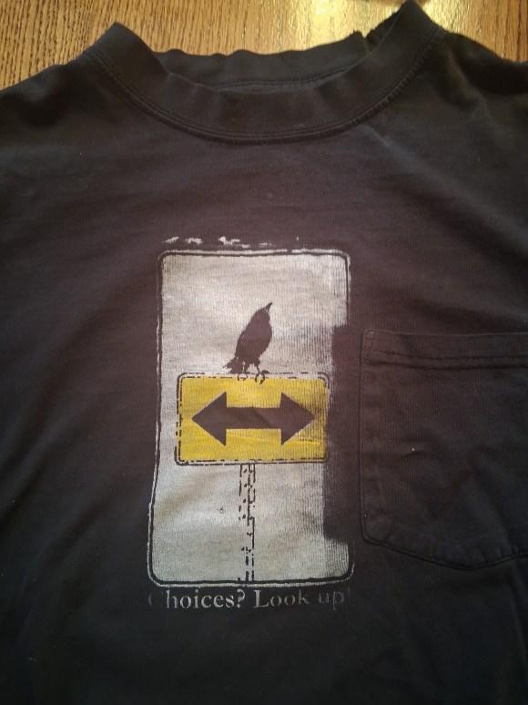
Pocket on shirt created issues …
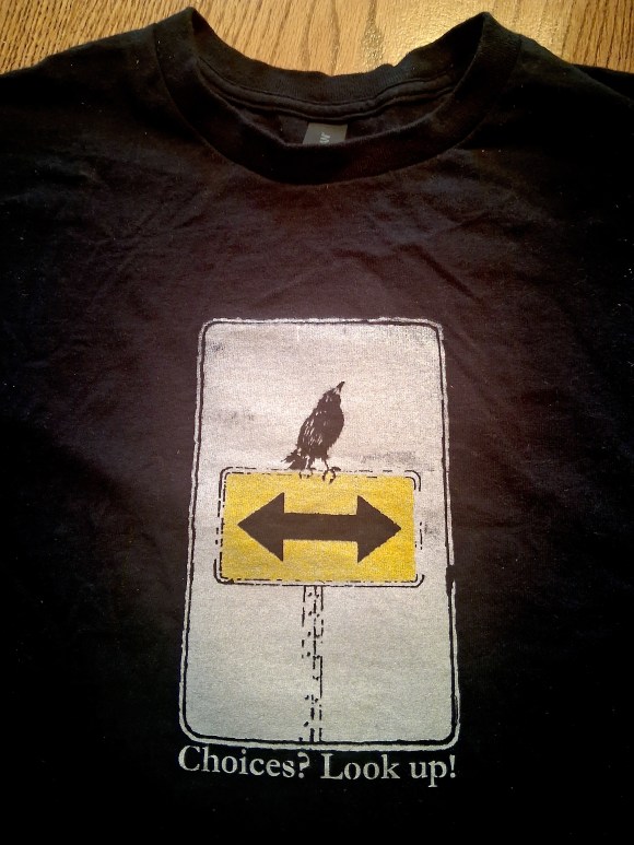
Shirt had a fold I didn’t see …
A good image, good register (not-so-good photo), but this one is useable
It’s been six months …. oh, gad … now it’s been a year (!!!) since I posted! Seems, well, like a year – yet also seems like a few weeks ago.
Time – what a mess … In some ways, a day is a month-long dog-day … and also gone in a flash. The world spins, and like Mr. Buffett said, “I’m dizzy, so it may be so”.
I guess I’ll blame the lapse, in part, on a 2025 full of family tragedy. I’ve done a little work, but not much. Looking to turn the corner, hopefully soon, with an increase of thought and consistency.
We’ll see …
So, one thing I have been doing is fiddling about with my friend, the Choices Crow (from the letterpress piece (see post “Choices: Look Up! 12 17 2023). I’ve been playing with the notion of converting it to a T-shirt piece.
White printing screenYellow printing screen
I’ve done a little screen printing in the past – just a smattering over the years, so sporadically that I’m definitely still on the learning curve. But, without investing into new screens and presses, I’m playing with a budget approach: handmade screen/frames, no press … keep it simple (cheap) until if-and-when it looks like a plan to produce more than just a few.
Why? Well, it’s a message I believe in. Choices: problems: issues … look up (and of course, concurrently addressing what are my due diligences and responsibilities).
And, so in the case of this newest path of Inside: Looking Out:, I’m first-and-foremost, as with all my work, concerned with pursuing the Biblical mandate for the arts, creating art that conveys good news and hope. That’s a baseline.
Beyond, and in concert with that, I’m after the concept of beginning with the internal and moving outward – with the perspective of beginning with the perfect and acknowledging the imperfect.
So, I’m chasing this idea … explored and realized within a framework, a focusing, a simplicity and peace of controlled and specified balance of visual content, white space, … and with trying to get much better at watercolors than I currently am (… how I struggle!!).
And, I do find a peacefulness with the concept and the simplicity of these pieces. I also find a challenge in getting them done well (yeah, how I struggle …).
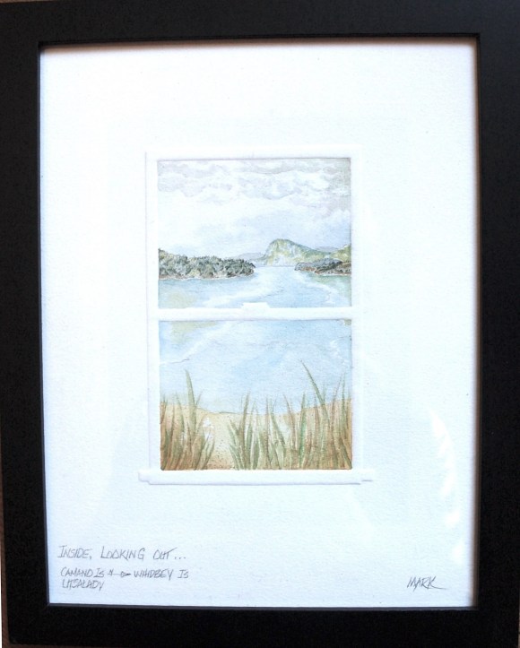
A post or two back, I initiated discussing this path, showing a piece in work … below is finished piece … (not a great photo – gotta work on that, too …).
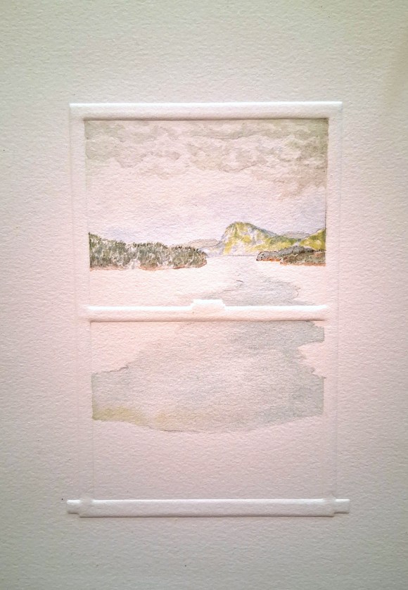
Inside: Looking Out Camano Is. N to Whidbey Is. Utsalady
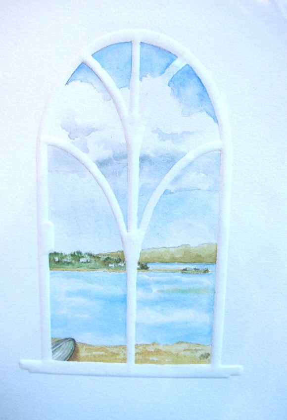
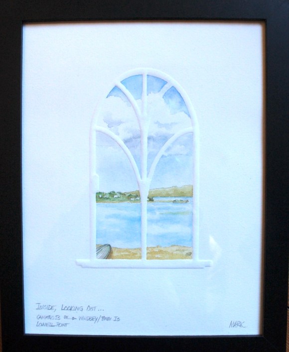
Another … detail and complete …
Inside: Looking Out Camano Is. W to Whidbey/Baby Is. Lowell Point
I’m SO behind on maintaining current posts. Thought I’d add another post about my oil paintings.
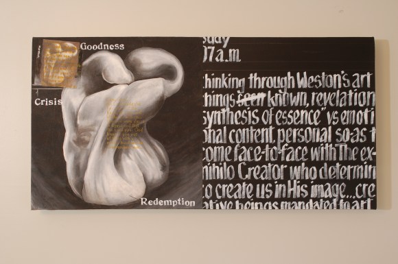
This one is shares some obvious elements – part of a series, eh? It’s a double square, 20×40″. It also shares the journalistic/conversational text the others offer. Materials and media … etc, so ok.
I think I elsewhere mentioned Ed Weston. So interesting to read his “Daybooks”, especially (for me) “California”. He was so determined to do artwork (photography, in his case) that was so refined-down to it’s purest, simplest, content/subject … unfettered by emotion, style, etc.. So interesting to read his thoughts … which pepper to shoot, what driftwood image keeps out of it’s own way, yet tells the story …
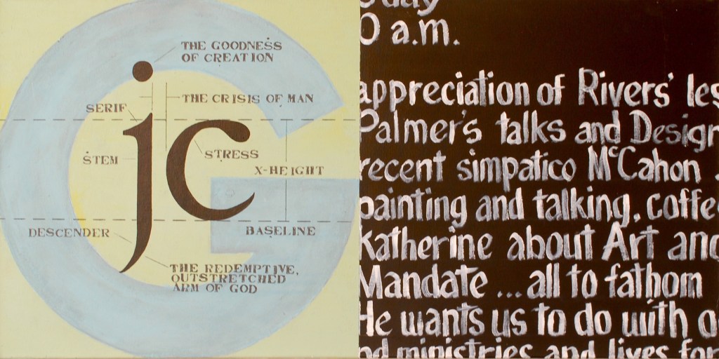
And, this piece hearkens. back to the very original pieces … see https://otcarts.com/2024/08/28/first-20x40s/, in that it re-stated the three elements of “Goodness”, “Crisis”, and “Redemption” … which are so exceptionally important to my art. Very profound search (and accomplishment – he created “pure” images, to be sure), and in some ways achieving aspects of “Goodness” or other times “Crisis” very well … similar to a contemporary, Steinbeck … but more monogamous – the two didn’t mix much with Weston … Steinbeck often held them both very well.
At any rate, this piece brings me to that conversation, obviously with a different perspective than Weston and Steinbeck, but needing and enjoying the search for that triune set of elements, that acknowledgement of that fulfillment … with proper humility and wonderment.
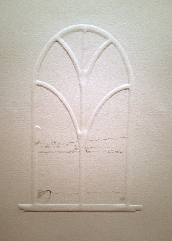
So, I began a series on Steeples – https://otcarts.com/2022/07/29/old-peach-chapel-inside-looking-out-project/ – a look at the purpose, variety and inspiring beauty of these architectural wonders. This path, spawned another series, “Inside: Looking Out” … the series (short, thus far) that looks at the glory of stained glass windows as seen best: from the inside, looking out (in contrast to the perspective of steeples).
Well, while working on (still another) project, I came upon an idea: combining blind embossing with the Inside: Looking Out series … well, with a couple of core elements of the series: watercolors, windows, and the concept of a inside-out perspective (which, in-and-of itself, has a variety of meanings and applications).
Now, the core-est of elements to both Steeples and Inside:Looking Out … and most-all of my work … is the spiritual aspect.
To achieve that end, I guess I could put a church steeple or a cross on a hill or other visual, golden sun-beams from forbidding clouds … or other some iconic reference, within the view. But, for me, once or twice might be appropriate – even accurate – but becomes a forced item, becomes shallow in context, and … that simply wouldn’t cut it. Forced, limited, and expected. No, that element in my work needs to have a different, sincere source and look.
Truly, and obviously, the spiritual can be found in the natural image: the beauty of nature, or creation. (At some point, I’ll post a discussion of what I believe to be the three elements of makes great art … a Bibli al mandate for the arts … or, maybe I’ve already gone thru that … I’ll research that … ).
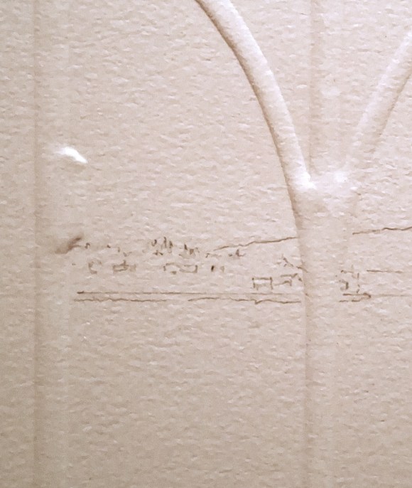
Also, please note that the subject matters which lie beyond the window are not meant to be true-to-life, documentations of the actual sites. Just as with the Steeple Project, I was/am not painting portraits of specific churches or landscapes … not at all. Rather, I’m more after spirit and character of the steeple/vista, spirit of the architecture/scene (however sophisticated or prosaic it may be), and the fun and challenge of painting. And, so in the case of this newest path of Inside: Looking Out: I’m after the concept of beginning with the internal and moving outward, with framework, with a focusing, with simplicity and peace of controlled and specified white space … and with trying to get much better at watercolors than I currently am (I struggle!!). And, I do find a peacefulness with the concept and the simplicity of these pieces.
Onward … and more thoughts to come …
First look at an arched window embossment …
In-work, a simple window with beginning painting … 🙂
So, here is a second a piece regarding the paintings series I’ve mentioned lately (more to come). This painting is another of the three oils I am so happy to have shown at The Loft at Camano Commons on Camano Island, WA.
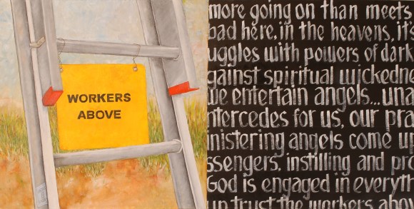
The visual source of inspiration for this piece, for me, is a fun, serendipitous one. I often pass a building that used to be a church. It has fallen into disrepair … but it looks like someone put a half-hearted effort towards repair … but obviously many years ago. The didn’t get far. I think they quit after leaning a ladder against the building: no signs that anyone actually climbed up. But there is leans. Hanging on rusty baling wire, about five rungs up is a very old, rusty, dusty sign: “Workers Above”. I find that humorous.
Hanging on a ladder leaning against a wall of a church creates a juxtaposition opportunity to translate the sign in another way. I certainly believe there is quite of bit of activity above … well above ground, the ladder, steeple and all!
By the way, here’s a look at the wall at The Loft … so thankful to Lydia and the Loft for the opportunity!
So, as promised, and as needed, here’s a piece on one to the paintings series I’ve mentioned lately (more to come). From last post, this is one of the oils I am so happy to have had hanging at The Loft at Camano Commons on Camano Island, WA.
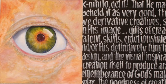
This piece has its base inspirations from several sources.The greatest is the recognition that God’s creation was “out of nothing”, ex-nihilo as the Latins would have it, a creativity not dependent upon existing materials or concept … i.e., God created a tree without first going to the greenhouse, a guidebook on trees of the world, or to the lumber yard. We, created in God’s image, are created as creatives … and not just artists, but humankind is generally creative, thus we have some folks who are very creative when it comes to parenting, to plumbing and to bookkeeping, etc.. Yes, some bookkeepers may not be all that, but then, neither are all artists (ya think?).
We are creative to be sure, but derivative creators. We create by building upon other input, existing materials and concepts … adding-to, taking-away, freshly combining, re-translating from personal perspective, etc., etc.. In pigment, the primaries are red, yellow, blue, and black (CYMK) … in digital sources, red, green and blue (RGB). Given that, ask yourself: “Self, create a new color the universe has never seen”. What do we try to do: imagine taking existing colors and mixing them. Derivative. I spent my career in graphic design. So much is built upon existing design. Even those who are first-line and seem to be radically out there, are building with existing letterforms, shapes, style/lack-of-style, palettes, etc..
It’s a huge topic and goes on-and-on, but in a nutshell, that is one of the spark plugs for this painting. It’s so exciting to see our creativity – I marvel at how craftsmen of the world built, with fewer tools and such, castles and cathedrals and bridges … and today computer chips … gad, how do they make aluminum foil so thin!!! All this creativity, how folks of the past have been so creative to build and create over and over again. I’m astounded at our creativity we’re blessed with.
I’ll begin with a very early one. Actually, this one began as the painting I donated to the MBA. That piece was about 48″ square. It was, essentially a large version of the left half of this painting.
The concept has its roots partly in a series of talks I attended, given by the late Dr. Earl Palmer. The series was entitled “Biblical Mandate for the Arts”, in which he proposed that the Bible has a directive for the arts. Very interesting, and I think well-founded, inspirational.
It also has roots that go way, way back to my art school days. I was doing photography-as-art then, and actually, the pieces I was doing then are remarkably similar to these paintings: part image, part text, extreme emphasis on the concept (I was called a “conceptual artist”), and very personal in context. Each piece contained hand-written elements as well. This work was included in a pivotal show of photographic work at LA County Museum of Art – way back when.
Anyways, here’s one of my establishing, recent-ish paintings to consider. Again, nodding toward Dr. Palmer, also to Larry Rivers, to a very recent discovery (for me) – Colin McCahon … and to design/typographic sensibilities.
All are oil on canvass (I’ll post more), 20″ x 40″, a double-square format.
[… ok, a grand gap in postings … as I’ve said before, life happens, but posts sometimes not-so-much.
So, finally I surface with another series of post-posts … work produced previously to these writings, but now ready for me to show].
So, here is an aspect of my meanderings that I have not, as-yet, shared, but the time seems right now … I think it’s a Nudging.
For quite a while now, I’ve also been doing some work in a different media, a different size, and on different subject matter. Yet, while those elements are indeed looking different from what I’ve been writing about and showing you, it is not totally “different” for me – in fact, some of the elements hearken back, decades-past, to some of my first serious art work … and continuing on to today. Aspects of that continuum include double-square formats, personal/autobiographical inclusions, typography, hand-written visuals, etc..
The series of paintings, to date, number 7 or 8 … 10 -15 if I go back several years to initial works – one of which I donated to the Museum of Biblical Art in Dallas during their call-for-art-donations after a serious fire in 2005.
However, this year … however sporadically, I’ve been working on the series – resulting in a small show – more later on that. First, I’ll give some background ….
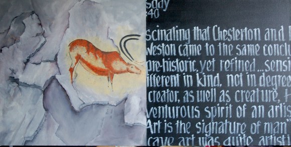
G.K. Chesterton, in the Everlasting Man (published 1925) discussed mankind as a created-as-creative beings … with a mandate for the arts. A great statement: “Art is the signature of Man.”
Also reading, again, Ed Weston’s Daybooks … California – in 1930 … he was having conversations with Dr. Becking, a scientist/friend living in Carmel … Becking showed him a book of cave paintings, to which Weston – who I seriously doubt was a believer – said “……” … these drawings are from a highly cultured race, they were done by extremely sensitive artists, certainly as fine as anything contemporary.” Later, he refers to how much contemporary art looks simply primitive … the fact that “… crude, ugly, childish, proves nothing …” of primitive, un-evolved mankind.
These two diverging/disparate/? thoughts … I don’t believe they ever met, Weston and Chesterton – the artist and the scientist, and both astounded around the same time by the creativity and skill of “primitive”, caveman/cavewoman art. This fascinates me. That, along with a specific teaching series from the late Dr. Earl Palmer at UPC … inspired me towards this piece.