Ok, remember now … last post … I did say that the black printer would be a bit harder than the yellow. I also hoped I’d get the edition to run about 50.
Well, harder: Roger That.
Edition of 50: well, looks like 25.
My story …
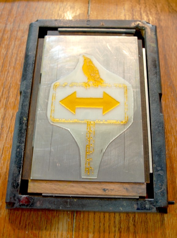
Had the plate ready to go, racked up … added ink and began running them. First issue, I had a tough time getting ink viscosity correct … or, maybe it was the volume of ink on the platter … or maybe something else. At any rate, I was able to get a couple looking good, but then the plate details would block up.

After a cleanup, a few more good ones … then blocking again. Simultaneously, I was really struggling with registration. The print would run high, then low, then, then left, and … you guessed it …. right. I finally ended up getting pretty consistent by simply eye-balling the alignment. Next time, I’ll need to work up a more direct and accurate manner of aligning plates.
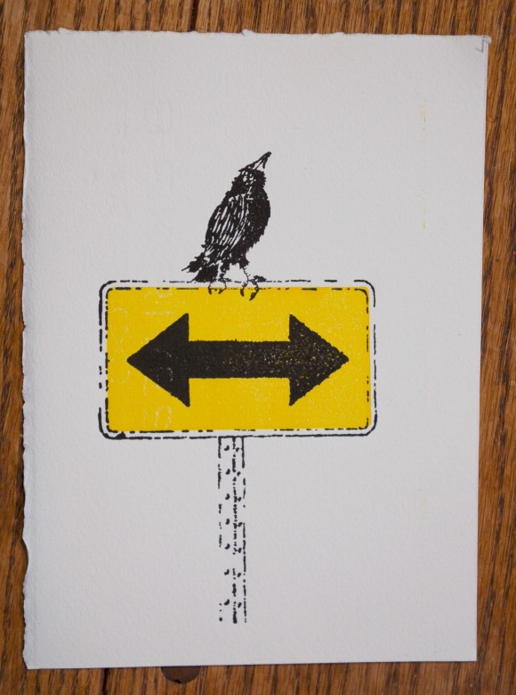
So, by the time I was done, I had around 25 or so acceptable impressions … some … dare I say … “most” …. quite good.
So, my limited edition is even more limited than I thought. But they look good – very good. I’m very happy with my drawing and design … and I’m improving (somewhat) my printing skills.
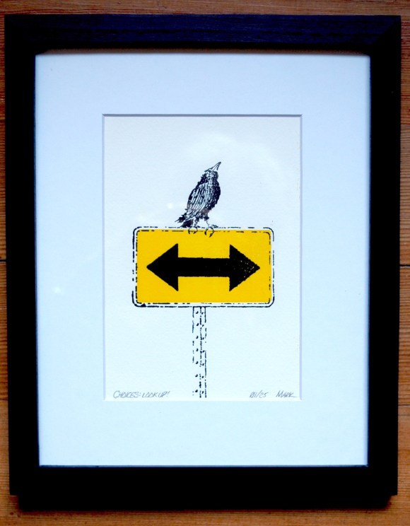
I’ll add a shot of it matted, title/numbered, and framed below …

One reply on “Choices: look up!”
Turned out beautifully 😍
LikeLike