[This is one of three posts I’ll do today, each something of a short catch-up: I have a few pieces I never did do a post for … not sure why, busy, I guess].
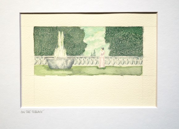
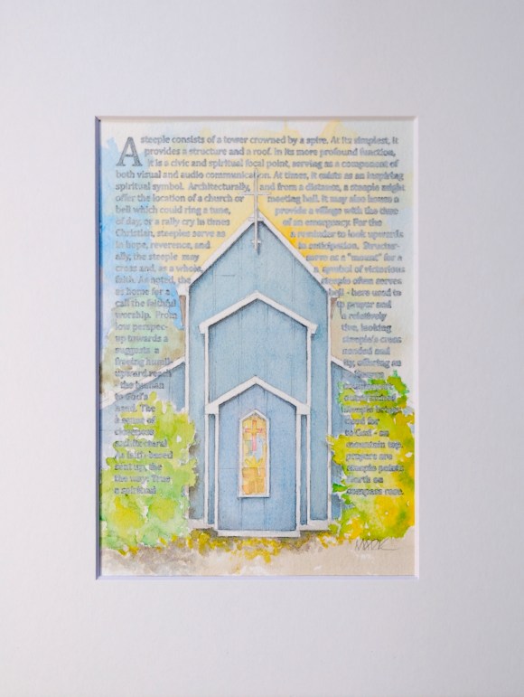
I love this painting. For me, it’s like a scene in a Jane Austin story. There’s a vintage feel to it – not only the subject, but also in the technique/media. There’s a story in this painting that the viewer may bring to mind, to heart.
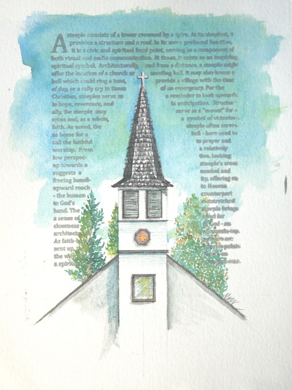
The window mentioned in the title isn’t the most prominent feature of this church, but it stands-out in this story as important because it represents a first for me. And, while not “most prominent”, it is one of several key features … and simply a fun shape. I’ve admired this church and steeple several times before – I pass it once a month or so. It’s what I’d summarize as a pleasant looking, country church … and one I’d like to add to the Steeple Project.
As I’ve said elsewhere, these renderings are not meant as portraits of specific churches or steeples. They are not intended as visual promotions of specific denominations. Most, indeed are visually inspired by specific, existent churches … and by their architectural and spiritual purpose. For most paintings, I begin with a snapshot of a church/steeple that I pass-by: sometimes a good, composed photo with my Nikon DSLR … and sometimes (most often) with my wonky phone camera thru a car window.
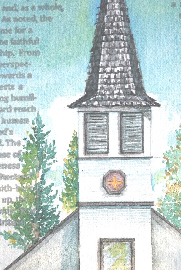
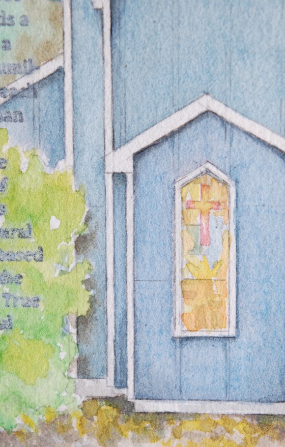
The latter methodology is the case with this painting. And, a crummy photo at that. But, I’m used to that and can get most detail I need from it. However, the little octagonal window – I cannot see any detail. I don’t know if it’s stained glass or standard window … and if the first is the case, what colors are present, what shapes are there, what story does it tell? That, I’d like to know – even though I’m confident its size in my painting will not allow me to show much. But, though I freely exercise “artistic license” 🙂 I also would like to have any detail I show – however tiny and soft – be accurate and true.
To that end, and here is the “first” I spoke of above, I actually contacted the church to ask what the octo window depicts … colors/images/etc.. I’m currently waiting for info.
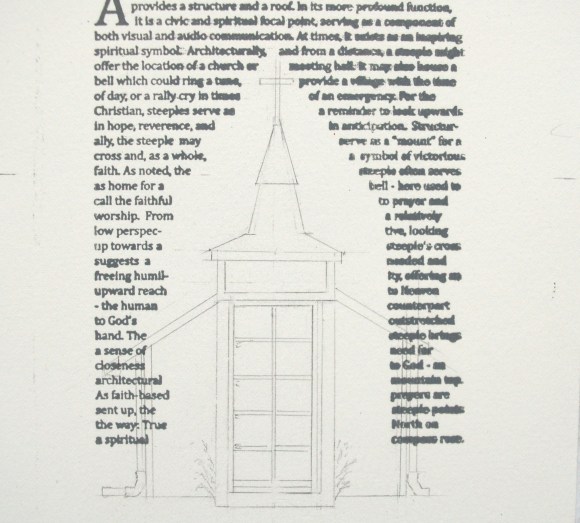
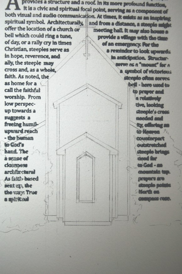
Meantime, here is the initial sketch:
And with that, I’ll post thus far … and add more later.
Blessings –
Later … well, as I mentioned, I tried to contact the church (via its website email), but haven’t heard back. They’re most likely short staffed and spinning to meet ends. No worries. I decided to paint the window with a cross – no way to loose with that choice – maybe a bit in accuracy, but on-target in context.
I’m about finished, but cannot do-so completely until I get back home (currently on the road) and get final photos.
Ok, back in the studio. I like the piece, it’s a straightforwared look at a straight-looking church … sound, solid, and uplifting. I’m particularly happy with the trees in this one. I didn’t work at overly, and I think that shows favorably. Here’s the final painting:
Some steeples are heroic in architectural gesture. The highest church building in the world (owing to its steeple, of course) is the Ulm Minster in Germany at 530’ (with the Sagrada Familia in Barcelona hot on it’s heels at 566’ – but is unfinished I read). In the U.S., it’s the Riverside Church in NYC at 392’.
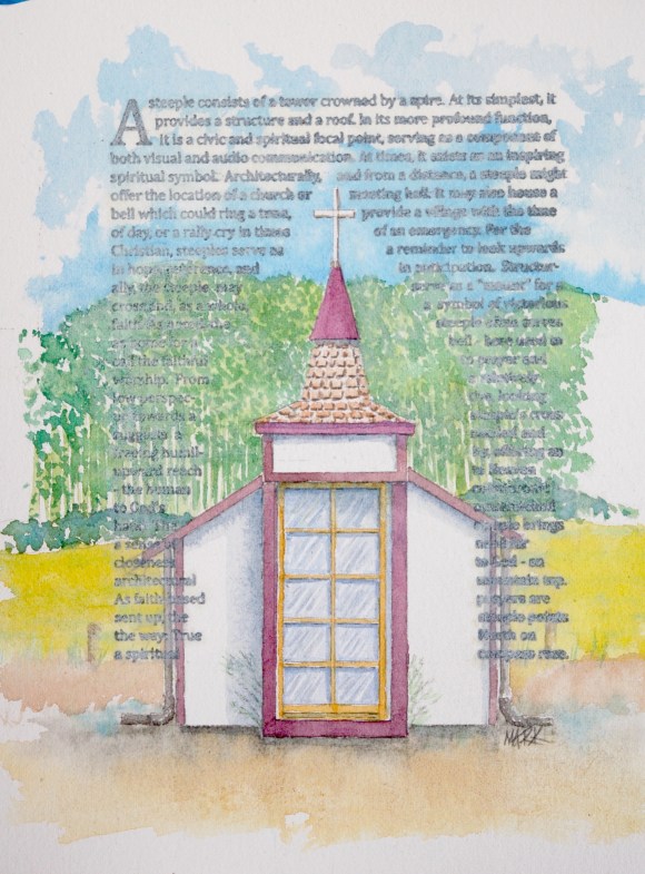
Traveling on a major E/W highway, we often pass a welcoming, yet demure little chapel along the way. This roadside chapel offers the traveler a place to stop, reflect, pray, and/or rest. Not much room for anything else – but, with those offerings, who needs “else”.
From the look of the door size, this edifice, thrusting rocket-like from ground-level, soars a commanding 15, maybe 16,’ into the sky … thanks to a robust spire and cross. :). I assume the congregation of Ulm Minster fears not.
What a joy to see this little chapel: roadside, welcoming, clean, and optimistic. So, it joins the Steeple Project.
Below, the initial sketch:
Stay tuned …
Ok, completed, and I’m happy with it.
I finished it with a bit of a different look … most of the previous paintings have been very light in the text area – by design: I want the steeples to pull forward of the background. This one, I’ve painted more full-valued than some of the others.
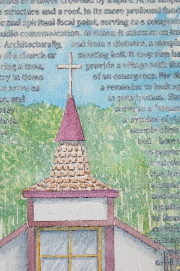
A detail:
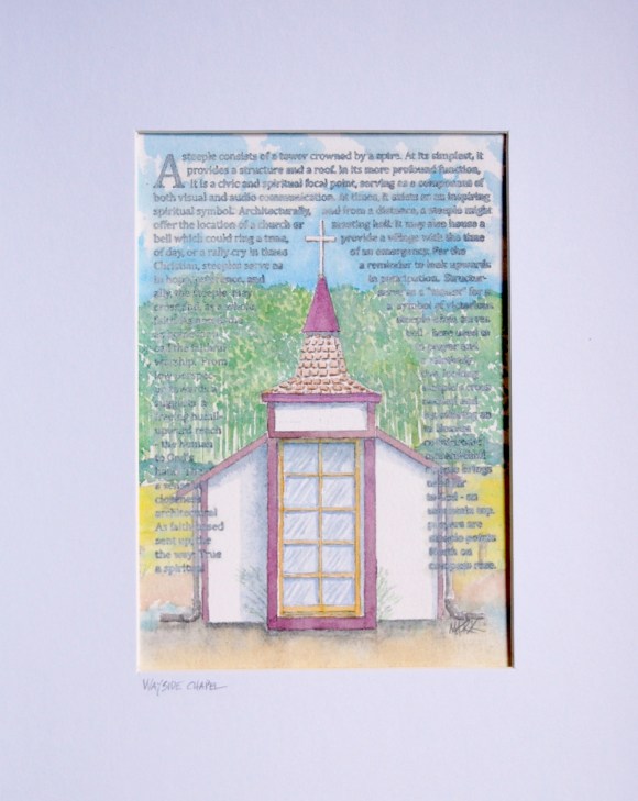
I’ve also done something differently on this one – I’ve inscribed the title on the mat.
sI like this, and intend to go back thru the completed paintings and inscribe them as well. Note: these titles are not the names of the churches that inspired the paintings … rather, they’re my titles of the paintings I’ve done. 🙂
Remember: peripatetic, right? At present I’m working on a new painting for the Steeple project [Wayside Chapel] – I truly enjoy them, so that’ll be an ongoing project.
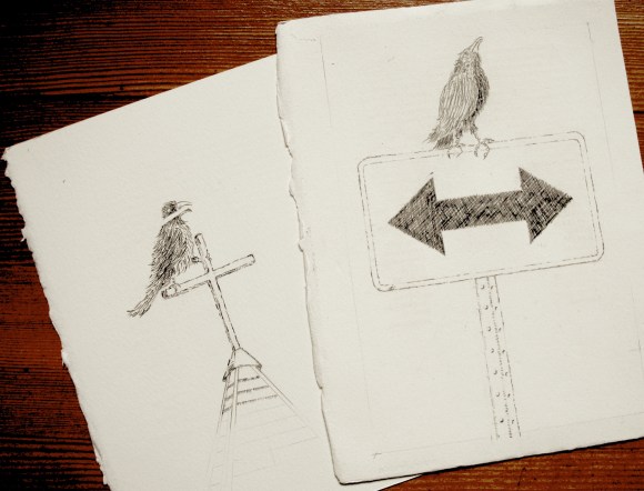
At the same time, I’m doing art for a bit of a new direction. The art I’m working on – basically drawings – are to convert to line art for press plates (with help from the great folks at Boxcar Press) for my letterpress. After printing this “base” art, I’ll go back in and work some watercolor into it. I plan to run these as a numbered, limited edition series.
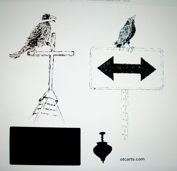
For fun and preview, here’s the starting sketches:”Cross and Crow” and “Choices” … both to be a series of pieces.
And ganged-up for plate making (the black rectangle is the yellow printer for the sign background, the top silhouette restates my homepage “spinning like a …” )
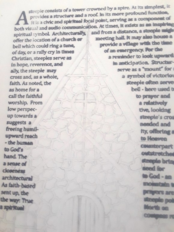
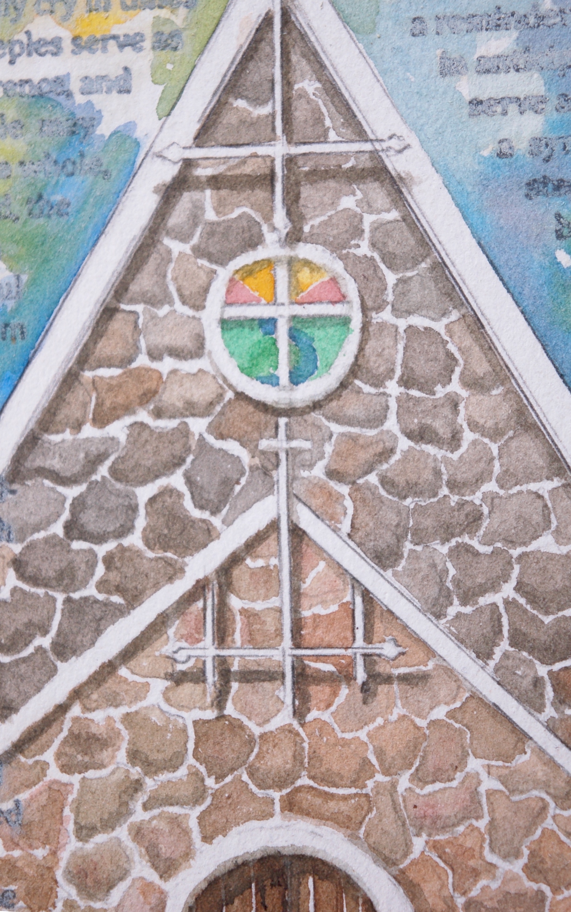
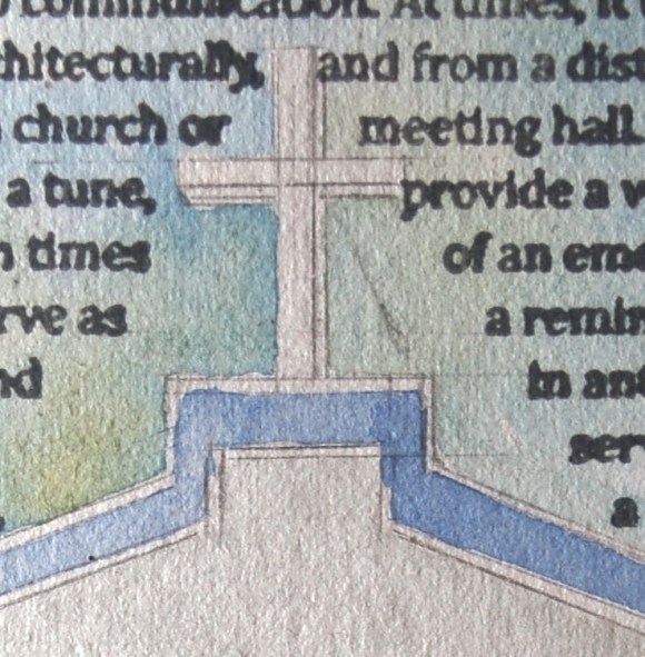
All … well, most … of the steeples painted in this series are based on churches I’ve passed-by in my meanderings. This one, however, is a bit different. The basic shape/etc of the church is from one I saw in the opening credits on a 1940’s movie I recently enjoyed. Artist license allowed me to make some alterations … but, mainly, it’s the same church – solid and sturdy looking – the back pitch very steeple-like in it’s severe angle and subsequent upward thrust. One aspect that really captivated me are the white cross-boards (architecturally, there is probably a great name for these). If they were very heavier beams and inside the structure, running from roof rafter to rafter, they would be a structural cross-tie used to fortify. These, being much lighter and attached to the facia boards, are more decorative than anything. However, they are a very nice touch – whatever their use. Both of them, on both pitches, run directly up and becomes the upright of the crosses … and also re-state the cross members of the two lower windows as well as the round window on the steeper pitch. Nice touches that re-state and establish consistent visual, even spiritual, interests overall.
Here’s my initial sketch:
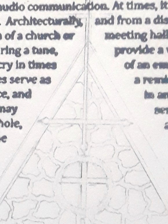
… and a detail … (apologies for image quality – all I had at the time was my phone camera …)
Some churches/steeples are dramatic, graceful architectural up-thrusts … beautiful, regal and formal. Fancy filigree, crisp whitely-painted defined moldings, beautiful shingling. An architectural equivalent of putting on your Sunday best … pipe organ strains of Bach flowing thru the double-arched doors. Gloriously uplifting and beautiful.
Other churches/steeples can be prosaic and humble … dare I say, plain. Here, the architectural equivalent that hums “Just As I Am”. Simple, honest … yet powerful and beautiful.
I love them all. You see, it’s not necessarily a height thing … higher is not necessarily better. I think it’s more of intent.
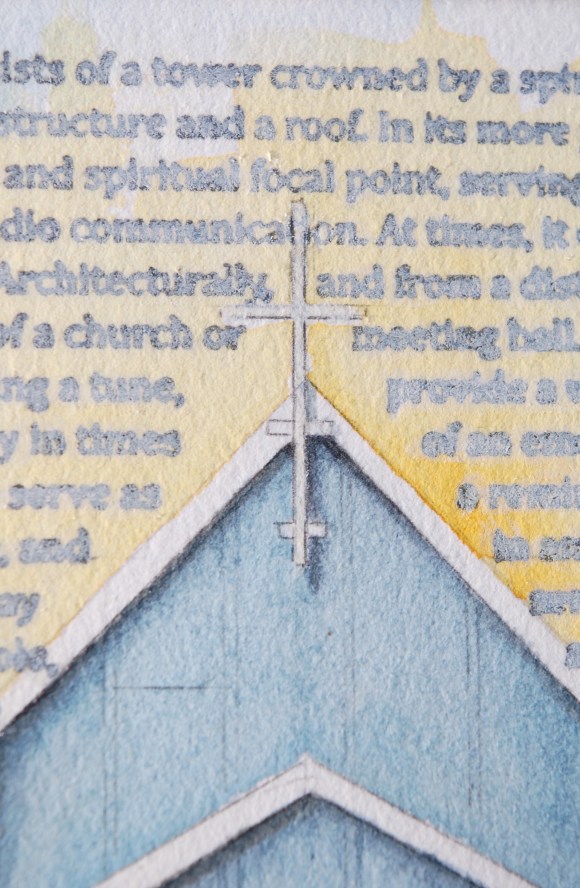
The original intent is often multifaceted (as mentioned in the image’s letterpresses text). For me, the most important is the symbolic architectural gesture, that mortal hand lifted aloft to meet God’s outstretched hand down to us. And, since God has a long reach, the height difference between a cathedral’s soaring. spire and a bungalow’s modest, cross-topped pitch, isn’t decisive. If the intent is to look-up … to reach-up, then it’s sincerity to the Source that’s key.
As I said, I like the variety, probably because I like the intent – or at least, the implied intent. Know this, reader: not all churches that have inspired my little paintings are churches I would attend. Others: gladly. If I ever get into painting restaurant signs, the same will be true. I don’t particularly like bad food. 🙂
When I first began this piece, I was thinking of letting the text remain full-black – it looked good and contrasty. However, in reviewing my previous paintings, I decided to lighten the text. While the contrast is indeed attractive, lightening the text still pushes the image forward … and that seems particularly important with the subtle, delicate nature of watercolor.
Here is the beginning sketch.
This very simple country church has that same stature as a man who, though his suit of clothes is warn and threadbare, still is. pressed and clean. “Humble”…”dignity”… “respect” … are words that come to mind. Also, “sturdy” and “strong”.
And final matted piece: very happy with the color and rendering 🙂
Sometime back, I did a painting of what I called a Mission-style church steeple (Mission Style … steeple project Sept. 11, 2022). I grew up in Southern California. In what might be determined by someone with a deeper understanding of architectural styles (which is to say, any architectural sense at all), that my inclination to define these styles as “Mission” or “Mexican” is a well-intentioned, fondly recalled … yet perhaps ill-informed bit of wisdom. Happy to stand-corrected if need be. Meantime, it works for me 🙂
That said: here, we found a less-formal, simply-architectured edifice that has (again, to me) a “Mexican/Mission” feel to it. Clues, for me, include a stepped-design pitch with flat horizontals (instead of roof lines running straight to a pointed pitch), white painted stucco (faux adobe, if I may mix language references) facade, brightly colored trim boards … a stout and substantial presence.
Above: the beginning sketch … poorly lit … but, a peek at the start. A very simple look. I guess one needs to stretch a bit to find the actual “steeple” of it. However, it does have much of a high-point, but it is a purposeful vertical reach – adorned with a cross … so, this artist declares a certain steepleness to it – and, as-such, worthy of a little painting.
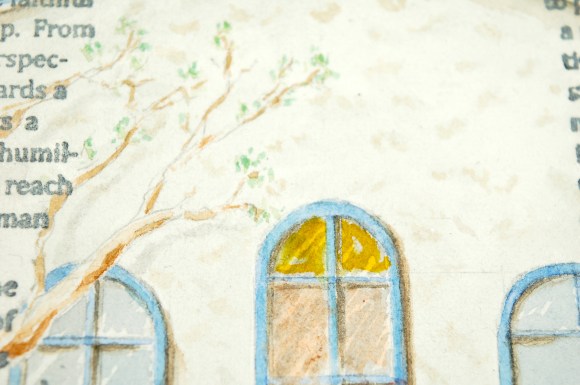
You’ll note a tree branch included … it is a purposeful, if not fully accurate, inclusion … an homage to the church’s neighborhood which was named for its incredible oak trees …
The detail above: yes, I’m including the turnbuckle/guyline. 🙂
And, below, the final. I’m very happy with it. A simple facade, but the blue eaves define well against the hint of stucco texture. From a growing artist’s technical perspective, I’m Very happy with the windows – especially regarding the glass. I think I’ve finally found a great look for window glass. My original temptation was to leave they white – glass is clear, yes? However, if you look at houses/etc from the outside, the windows are usually very dark with the defining look being how much and how bright the reflections are. I like how I’ve defined these.
Ok, yes … a month later … life happens, sometimes in capital letters … LIFE HAPPENS … so yeah, I’m late in returning to our little chat …
So, after another gap in time, here we are.
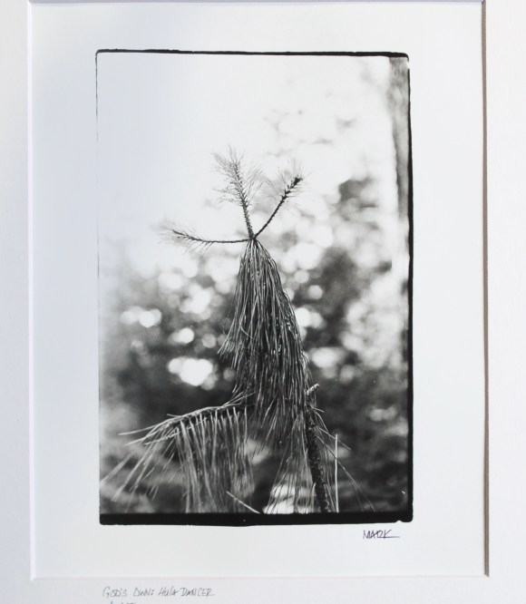
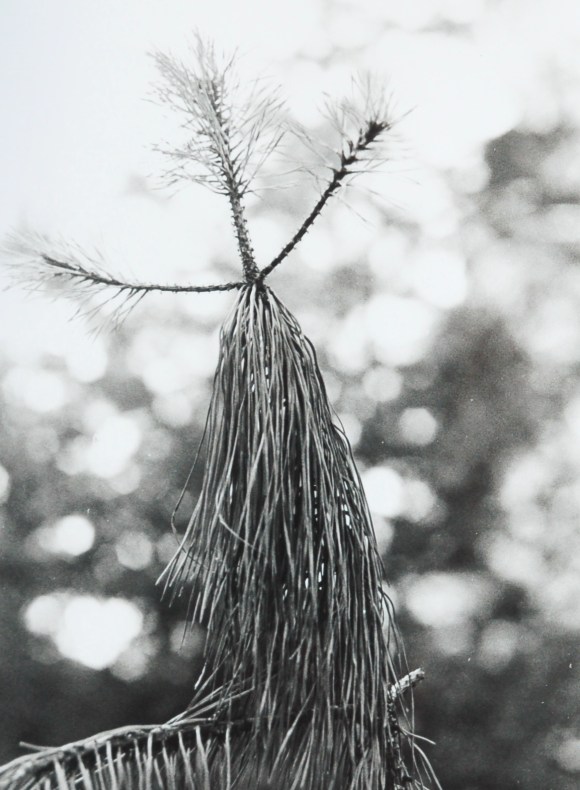
The hula dancer: we were on a walk and there it was: dancing in the wind above the weeds, amongst the firs … in the distance, beyond the soft sound of the wind in the grasses … I’m sure I could here a soft Don Ho song … na, just the wind.
But it struck me immediately: there’s God’s Own hula dancer! Sure enough, sitting atop a small tree (well, actually, it is the top of a small tree), there swayed a cute, swaying, God-created, dancer – grass skirt and all!
A perfect grass skirt … swaying about … no Elvis, but a scene from Blue Hawaii (or maybe Magnum … or maybe a visit to the Tiki House), beside the trail, in full array and choreography from on-High …
Remember back when I first confessed to a peripatetic approach to art (watercolor/oil/letterpress/photography/on-and-on…)? I didn’t list welding/metal/sculpture on that initial list of semi-pro/wannaby art media dablements, my scattered interests. Who knew?
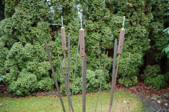
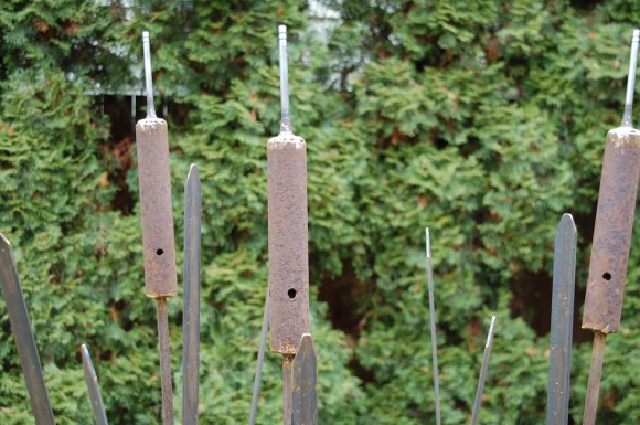
I did, in my defense, mention that my wife likes cattails, and yard art. A couple months back, while wandering thru a nursery on the other side of our state. we came upon a rusted, very cool metal yard art-thing that was cattails … but alas, not for sale, rather declared to be just a part of the nursery history. Of course, in my unbridled optimism, I declared that to be something I could build for her … no problem.
No problem. 🙂
However, Christmas sprung-forth, and I decided the cattail project to be the perfect gift.
So, off to the steelyard. found some really cool, octagonal rod (stems) and some 1 1/4″ flat iron for the leaves. I already had some beautifully rusted tubes (old brackets) and decided to use old car valves for the tops/top stems (I’m sure there’s an official name for those “top stems” … we continue to learn, right?). [Editors: after a question mark, and a closing parens, is that period correct?] [Editors: brackets vs parens… ?] [Editors: ….. thanks … but, never mind … ]
Anyways (focus), …. then came Production. I’ve done some welding on my little wire welder … works ok (though I’d never, never trust it (my skills) for something structural, like on a trailer or such) … but, I truly need to get some training: my welds are so messy, not the smooth/creamy looking bead created by someone who really knows how to weld. I spend more time cleaning it all up with a grinder afterwards
I’m so excited to post these! It took several weeks longer to do-so because my first photos of the finished pieces were not-so-much, so I needed to re-shoot them. Problem was I’m was in the middle of a bathroom remodel. I, as I always have, did all the work myself (electrical/plumbing/tile/floor/painting/etc), so … priorities being what they are ….
Then, I got the flu …..
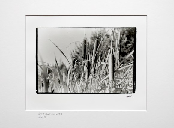
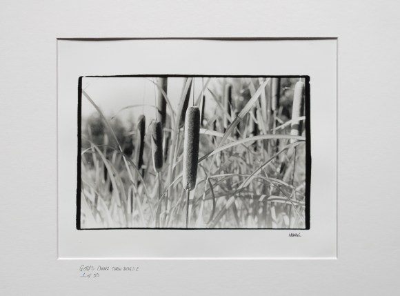
Alas, back in the saddle again. As I said in my last post, I actually have two pieces: God’s Own: corn dogs on-a-stick I and God’s Own: corn dog on-a-stick 2. As I also mentioned in my last post, it was so great to get into the darkroom again (true, frustrations abound: tight space, no plumbing, questionable light-tightness, etc.. But … quit complaining: what a blessing I have, truly! It’s a bit rough, but I have a darkroom!) So, yeah, what fun!!
As I mentioned, I decided to print a couple negatives, liking them both … and glad I did. they both have something a bit different (primarily composition/perspective) which gives them very different attitudes … both of which I’m very happy with!! (As I’ve said in the past, I’m not all that happy with my photos of art … just don’t look like they do in person …)