(Oops, forgot to grab sketch/in-progress shots … so, on to the final image).
Calling this one “Red Dome”. Not sure if it is copper or clay or painted, but the dome shape grabbed my attention. In color, kind of an off-rust, reddish, etc.. Very peaceful in some way: not so much a major vertical thrust, but still a reach upward to Heaven with graceful lines and curves – the dome wedges matching the octangular (or ten-tangular?) tower. Beautiful steeple.
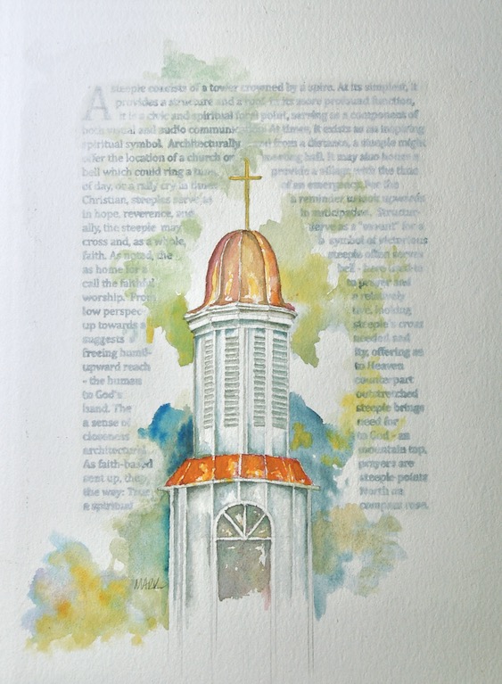
Painting-wise, thus far, many of these share a common look: churches are, for the most part, white. So, I am thankful for shadows of siding and vents 🙂 . On this one, given the dome and steeple roof material, I really tried to push for accurate, but heightened color. The result is that I really like this steeple and its bright color!
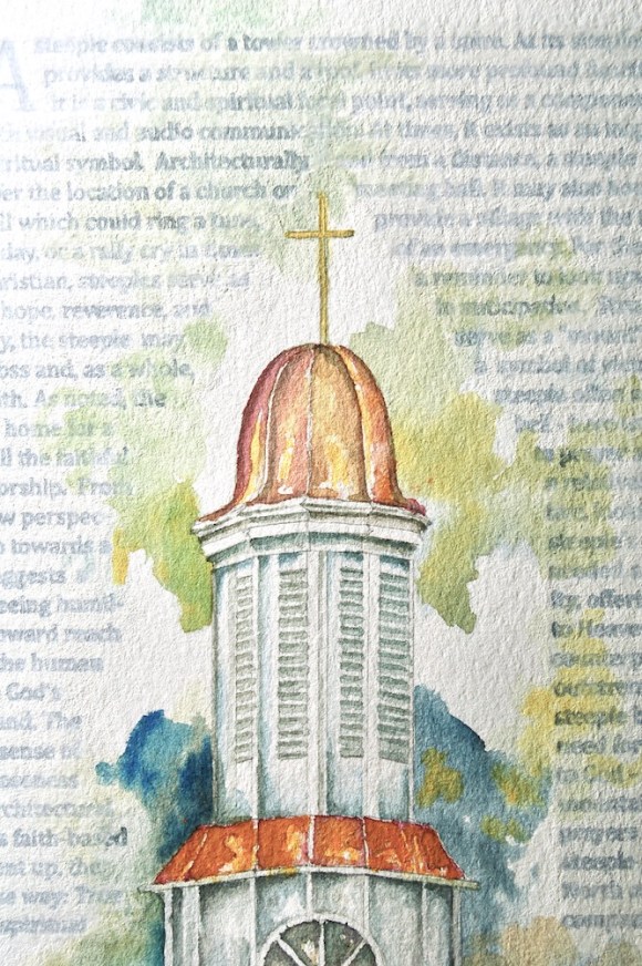
Here’s the detail shot. Very happy with the drawing too.
A side note on the background text. I made a bit of a change. Previous paintings use a letterpress version that I printed using very light grey ink. You’ll recall from earlier posts on the printing aspect, my first letterpress run, using a dark grey ink which turned out printing well, but much too dark for my liking. My intent was to have the text very background so-as not to upstage (visually) the delicate watercolor to come. So, I did a second run on the little press with a very light ink – much better (though the legibility on the second run suffered a bit).
On this painting, I used one of the original, dark text prints – and did a series of loose washes of white watercolor over the text, creating a painterly, loose background that is both legible and yet subdued. Perfect!
This, I think, will be the new direction for a while … 🙂
FYI … this painting for sale in my Steeple Project Gallery … 🙂
.
